Trendstile
An online magazine where you can pick up the latest trends from the fashion capitals of the world before anyone else.
The challenge
Anyone who knows me well will know that I’m absolutely obsessed with fashion magazines. During one of the weeks at my UX/UI design bootcamp in Ironhack Madrid, we were tasked to design an online magazine in a group. We were given various user personas to design for and I obviously chose the one that had fashion and trends as their main interests.
Together with two of my classmates, Nora and Miguel, we designed this online publication concept in five days. My most important role in the group was giving the key ideas we used for the project and for the branding.
The problem
Online fashion magazines have a lot of information but our user wants something more visual, up to the minute and straight to the point.
Websites dedicated to fashion and trends have articles that are too lengthy and hard to read.
The users
The audience for this website are young women, Zillennials and Millennials, who want to know what’s happening next, the trends that are coming up and they want them now. With social media, these digital natives are accustomed to finding out what’s happening anywhere in the world in an instant. They’re visual, they have short attention spans and are constantly connected.
The Solution
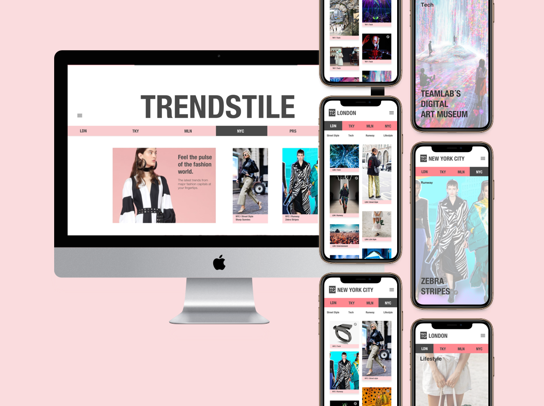
Trendstile is an online publication that gets its content from the streets of the fashion capitals of the world where a lot of trends are born. Trends in fashion, technology, entertainment and lifestyle, segregated depending on the city they are from, are all in one place presented in a format that is visual and easy to digest.
We designed the pages with sliding navigation bars for the cities and for the sections so users can jump from one city to another. For the MVP we included six cities:
London
Tokyo
Milan
New York
Paris
Berlin
Articles are condensed in an easy to digest format, focusing mostly on photos. Each city has the following sections:
street style
runway
tech
lifestyle
entertainment
The process
Guided by the design thinking method, below you’ll find the process that culminated to this solution.
At the beginning of the project, we ran into some roadblocks. We were given a user persona and it wasn’t really clear to us what the goal of the user actually was. We had some disagreements as a group but we later on clarified that the user wants to be more than just a follower of trends. We had to take a step back and redo our Lean UX Canvas and SWOT Analysis to have a better idea of how we’re going to tackle the problem.
User persona
At this point it was clear to us that our user persona wants to be ahead of the curve. Our user is tech-savvy so aside from reading magazines she’s always on social media platforms that are heavy on images such as Instagram and Pinterest to get inspiration and get ideas for what the upcoming trends are. She needs an online publication where information is given to her in a compact and visual form as she has a fast-paced lifestyle and travels a lot of work.
We then created a user journey map and empathy map as seen below based on the user persona given to us to better empathize with the user and define the pain points. The main pain point of the user is when she’s attending an event and needs inspiration for her outfit but she doesn’t have time to sit down and look for articles and read. She wants to do it quickly on her way home before she heads out for the event.
We also did an in-depth analysis of the other online publications for trends and fashion. Doing the competitive analysis made us analyze what is currently out there and where we can position the website we are developing.
Next comes the ideation phase. The best ideas came about after a quick brainstorming session with the whole group. We were looking for a differentiating factor that can set our platform apart from its competitors. By using HMW, we asked ourselves:
How might we create an online publication that will keep readers ahead of the curve?
Brainstorming session
Since I have some background in fashion, I thought about how trends are born. There are some theories out there and one is called the “trickle down effect” where trends come from the highest levels of the fashion world like famous designer brands, magazine editors and the fashion week runway shows. Another is called the “bubble up” theory where the trends that come from everyday people in the streets get so big that designer brands use them for their own designs. The spotlight is always on the same handful of cities that are referred to as the fashion capitals of the world where a lot of trends come from. So the idea I came up with is a website that is divided into cities where there’s a mix of articles that not only focus on runway trends but also street style, technology, lifestyle and entertainment in each city. This will give the reader a global view into what’s happening around the world that will keep them ahead of the curve.
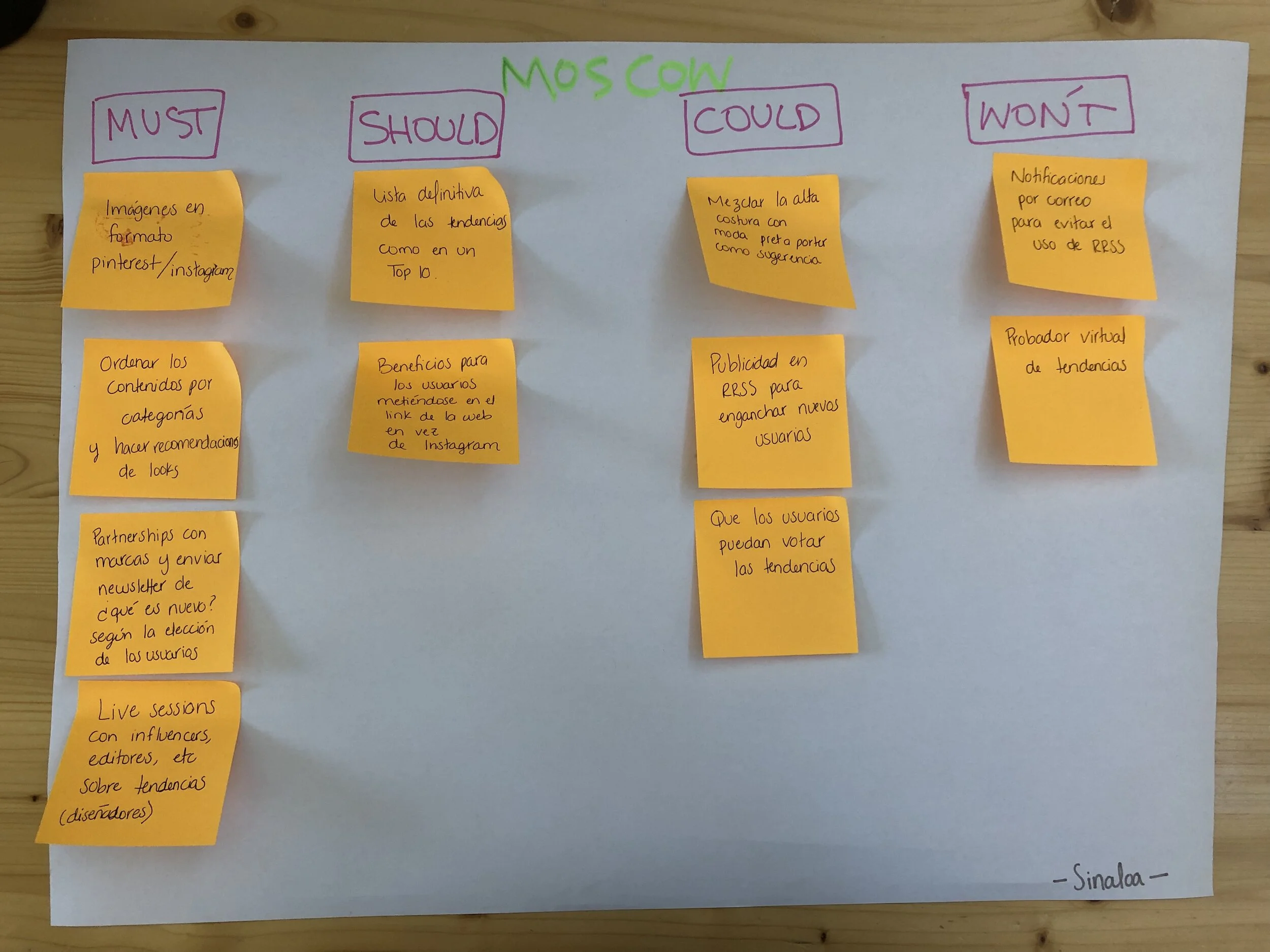
We wrote down a few other ideas that we can incorporate and evaluated how we were going to prioritize each by using the MoSCoW method. And for for the information architecture of the website, we did card sorting with five participants. Once we analyzed the results of the card sorting, we then created a sitemap and a user flow chart.
Due to time constraints for this particular project, we went straight into creating a mid-fidelity prototype using Sketch, forgoing paper prototypes. My teammate Nora did a great job finishing a lot of the mid-fidelity prototype quickly under a time crunch so we could test it.
Mid-fidelity
High-fidelity
Usability tests
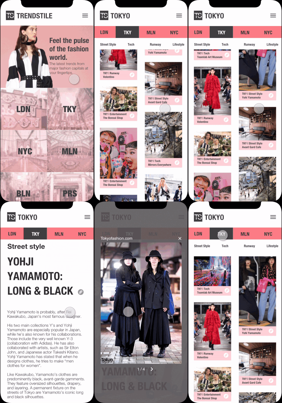
We tested the two prototypes with 5 users each with the tasks in the user flow we created as pictured. Users were able to navigate easily and 100% of the users were able to complete the tasks. We received some feedback from the user tests like:
The save/paper clip icon might not be noticeable in the photos so we placed it in the text box in the next iteration.
The article title should be included in the thumbnails, not just the category.
Some people might not understand the abbreviations of the cities.
There should be dates on the articles, which is something we completely overlooked.
Suggested articles the user might like at the end of each article should also be added for the next iteration.
Branding
The name is a mix of the different elements of the website which are trends, referring to the content and tiles, which refers to the images in squares for each article that are found on the main page of each city. It’s also a play on words since you have the word “style” in there but written differently.
I created the mood board and did desirability testing with five people. Using the mood board, my other teammate Miguel developed the color palette and logo. For the logo, he was inspired by one of the images I put in the mood board which has the names of some cities in the style of an airport departure board with one square for each letter.
Trendstile mood board
Micro-interactions
We used Flinto for the first time for this project and we were able to incorporate some micro-interactions in our prototype such as the shrinking photo when you scroll down on an article.
Next steps
Improve design based on feedback given during the presentation like changing city names to actual names and not just the abbreviations
Monetization by creating downloadable monthly digital magazines
Create content for men
Include more cities
Partner with brands for advertisements
Learnings
We were under a lot of time pressure with just one week to finish this project and with a lot of new things to learn like how to animate and design interactions with Flinto.
I personally learned a lot from this group project, not just about design but also about teamwork and about myself. I really appreciated my teammates’ honest feedback throughout the process and for trusting me with my ideas and I learned that it’s very important to trust your team as well.
